Reading comes first
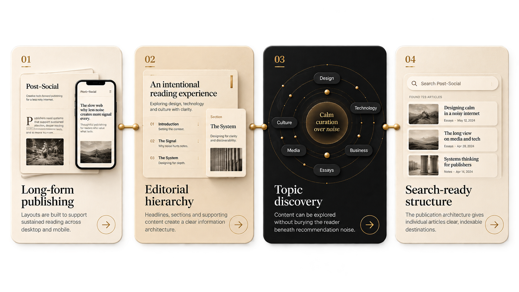
Typography and page rhythm are treated as product features, not decoration around the article.
 ← Selected work
An independent digital publication exploring technology, culture and life beyond the feed.

Editorial strategy
Brand identity
UX & UI design
Web development
Content architecture
Post-Social is an independent publication designed for long-form ideas about technology, culture and life beyond the feed. The product had to feel editorial rather than promotional, with the writing itself given the room and hierarchy it needs.
Long-form writing competes inside interfaces designed for speed, interruption and constant recommendation. The opportunity was to build a deliberate home where typography, hierarchy and pacing support concentration instead of fighting for attention.
Typography and page rhythm are treated as product features, not decoration around the article.
A restrained identity and clear hierarchy give each piece room to feel considered and permanent.
Topic structure and search-friendly architecture support navigation without turning the page into a feed.
Warm neutrals, black surfaces and high-contrast serif moments create a publication-like experience. Interface elements recede so headlines, standfirsts and article rhythm do the work.

Four connected capabilities create one coherent publishing system: sustained reading, clear hierarchy, useful discovery and search-ready structure.
Post-Social is a live publication with a growing body of editorial work. This case study focuses on the product and publishing experience rather than unsupported audience claims.
Whether it is a website, a digital product or something that does not quite fit into a standard box, start with the problem.